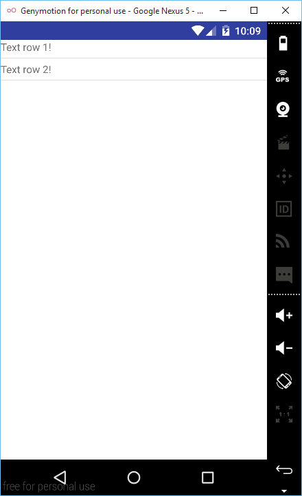
If you need to use a “list” divider, but you need it on a vertical LinearLayout instead of a List you can do this by using some attributes on the LinearLayout. It’s not very straightforward as you maybe expected, but it’s not very difficult either. Before starting, you have to know the 2 major things this tutorial will teach you:
- how to add divider to a VERTICAL LinearLayout
- how to add padding at the bottom between divider and content
Summary
- create 2 drawables: one for shape and one for the actual drawable
- add 2 LinearLayout attributes
android:showDividers="end"
andandroid:divider="@drawable/divider_drawable"for each LinearLayout
Now, let’s begin!
- Create a new project (activity_main.xml will be automatically generated. You will have to edit it later with the code from this tutorial).
- In the app – src – main – res – drawable folder, create a new drawable and name it divider_shape.xml. Inside this xml we will have to create a rectangle shape with a hight of 1dp for the divider.
<?xml version="1.0" encoding="utf-8"?>
<shape xmlns:android="http://schemas.android.com/apk/res/android"
    android:shape="rectangle">

    <size android:height="1dp"/>
    <solid android:color="#dddddd"/>
</shape>
3. Again, in the drawable folder, create another drawable xml and name it divider_drawable.xml. Inside this xml we have to create a layer-list which will use the drawable_shape.xml as drawable. Here is the place where you can handle the padding for the divider. In this tutorial we use top and bottom paddings.
<?xml version="1.0" encoding="utf-8"?>
<layer-list xmlns:android="http://schemas.android.com/apk/res/android">
    <item
        android:drawable="@drawable/divider_shape"
        android:top="5dp"
        android:bottom="5dp" />
</layer-list>
4. Now in activity_main.xml, add the following code:
<?xml version="1.0" encoding="utf-8"?>
<LinearLayout xmlns:android="http://schemas.android.com/apk/res/android"
    xmlns:tools="http://schemas.android.com/tools"
    android:layout_width="match_parent"
    android:layout_height="match_parent"
    android:orientation="vertical"
    android:background="@android:color/white"
    tools:context=".MainActivity">

    <LinearLayout
        android:layout_width="match_parent"
        android:layout_height="wrap_content"
        android:showDividers="end"
        android:orientation="vertical"
        android:divider="@drawable/divider_drawable">

        <TextView
            android:layout_width="wrap_content"
            android:layout_height="wrap_content"
            android:text="Text row 1!" />
    </LinearLayout>

    <LinearLayout
        android:layout_width="match_parent"
        android:layout_height="wrap_content"
        android:orientation="vertical"
        android:showDividers="end"
        android:divider="@drawable/divider_drawable">

        <TextView
            android:layout_width="wrap_content"
            android:layout_height="wrap_content"
            android:text="Text row 2!" />
    </LinearLayout>
</LinearLayout>
As you can see the “list” divider we want to simulate, uses the “end” value in order to be displayed at the bottom of the each linearLayout.
NOTE: Don’t forget to add the orientation attribute as VERTICAL for every LinearLayout. Otherwise, the default is Horizontal, and the divider won’t be displayed.

