TUTORIAL DEPRECATED
Use this tutorial instead: Floating Action Button New
In this tutorial I will show you how to add a Floating Action Button aka FAB, for pre Lollipop versions and for Lollipop. For pre versions it will be just a simple round button with shadow and click effect, but for Android 5.0 we will use ripple effect and elevation.
We will create a ListView and the floating action button will be positioned over the list on the right-bottom of the list.
1. Create a new project with minSdk:9 and targetSdk:21 and name your main activity as “MainActivity” (it should be generated this way when it’s created)
This is my build.gradle
apply plugin: 'com.android.application'

android {
    compileSdkVersion 21
    buildToolsVersion "21.1.2"

    defaultConfig {
        applicationId "ro.funcode.floatingactionbutton"
        minSdkVersion 9
        targetSdkVersion 21
        versionCode 1
        versionName "1.0"
    }
    buildTypes {
        release {
            minifyEnabled false
            proguardFiles getDefaultProguardFile('proguard-android.txt'), 'proguard-rules.pro'
        }
    }
}

dependencies {
    compile fileTree(dir: 'libs', include: ['*.jar'])
    compile 'com.android.support:appcompat-v7:21.0.3'
}
Pre Lollipop
2. Go to res – layout and add a new xml for the items from the list. Name your xml as “list_item.xml” and add the following code:
<?xml version="1.0" encoding="utf-8"?>
<LinearLayout
    xmlns:android="http://schemas.android.com/apk/res/android"
    android:orientation="horizontal"
    android:layout_width="fill_parent"
    android:layout_height="fill_parent"
    android:id="@+id/list_item"
    android:gravity="center_vertical">


    <TextView android:layout_width="wrap_content"
              android:layout_height="wrap_content"
              android:id="@+id/list_item_text_view"
              android:textSize="20sp"
              android:padding="10dp"
              android:layout_marginLeft="5dp"/>

</LinearLayout>
3. Go to res – drawable folder and create a new xml and name it fab_shape.xml. Copy the following code which will represent the shape of the floating action button with shadow and click effect:
<?xml version="1.0" encoding="utf-8"?>
<selector xmlns:android="http://schemas.android.com/apk/res/android">
<item android:state_pressed="true">
<layer-list>
<!-- Shadow -->
<item android:top="1dp" android:right="1dp">
<layer-list>
<item>
<shape android:shape="oval">
<solid android:color="#08000000"/>
<padding
android:bottom="3px"
android:left="3px"
android:right="3px"
android:top="3px"
/>
</shape>
</item>
<item>
<shape android:shape="oval">
<solid android:color="#09000000"/>
<padding
android:bottom="2px"
android:left="2px"
android:right="2px"
android:top="2px"
/>
</shape>
</item>
<item>
<shape android:shape="oval">
<solid android:color="#10000000"/>
<padding
android:bottom="2px"
android:left="2px"
android:right="2px"
android:top="2px"
/>
</shape>
</item>
<item>
<shape android:shape="oval">
<solid android:color="#11000000"/>
<padding
android:bottom="1px"
android:left="1px"
android:right="1px"
android:top="1px"
/>
</shape>
</item>
<item>
<shape android:shape="oval">
<solid android:color="#12000000"/>
<padding
android:bottom="1px"
android:left="1px"
android:right="1px"
android:top="1px"
/>
</shape>
</item>
<item>
<shape android:shape="oval">
<solid android:color="#13000000"/>
<padding
android:bottom="1px"
android:left="1px"
android:right="1px"
android:top="1px"
/>
</shape>
</item>
<item>
<shape android:shape="oval">
<solid android:color="#14000000"/>
<padding
android:bottom="1px"
android:left="1px"
android:right="1px"
android:top="1px"
/>
</shape>
</item>
<item>
<shape android:shape="oval">
<solid android:color="#15000000"/>
<padding
android:bottom="1px"
android:left="1px"
android:right="1px"
android:top="1px"
/>
</shape>
</item>
<item>
<shape android:shape="oval">
<solid android:color="#16000000"/>
<padding
android:bottom="1px"
android:left="1px"
android:right="1px"
android:top="1px"
/>
</shape>
</item>
</layer-list>
</item>
<!-- Blue button pressed -->
<item>
<shape android:shape="oval">
<solid android:color="#90CAF9"/>
</shape>
</item>
</layer-list>
</item>
<item android:state_enabled="true">
<layer-list>
<!-- Shadow -->
<item android:top="2dp" android:right="1dp">
<layer-list>
<item>
<shape android:shape="oval">
<solid android:color="#08000000"/>
<padding
android:bottom="4px"
android:left="4px"
android:right="4px"
android:top="4px"
/>
</shape>
</item>
<item>
<shape android:shape="oval">
<solid android:color="#09000000"/>
<padding
android:bottom="2px"
android:left="2px"
android:right="2px"
android:top="2px"
/>
</shape>
</item>
<item>
<shape android:shape="oval">
<solid android:color="#10000000"/>
<padding
android:bottom="2px"
android:left="2px"
android:right="2px"
android:top="2px"
/>
</shape>
</item>
<item>
<shape android:shape="oval">
<solid android:color="#11000000"/>
<padding
android:bottom="1px"
android:left="1px"
android:right="1px"
android:top="1px"
/>
</shape>
</item>
<item>
<shape android:shape="oval">
<solid android:color="#12000000"/>
<padding
android:bottom="1px"
android:left="1px"
android:right="1px"
android:top="1px"
/>
</shape>
</item>
<item>
<shape android:shape="oval">
<solid android:color="#13000000"/>
<padding
android:bottom="1px"
android:left="1px"
android:right="1px"
android:top="1px"
/>
</shape>
</item>
<item>
<shape android:shape="oval">
<solid android:color="#14000000"/>
<padding
android:bottom="1px"
android:left="1px"
android:right="1px"
android:top="1px"
/>
</shape>
</item>
<item>
<shape android:shape="oval">
<solid android:color="#15000000"/>
<padding
android:bottom="1px"
android:left="1px"
android:right="1px"
android:top="1px"
/>
</shape>
</item>
<item>
<shape android:shape="oval">
<solid android:color="#16000000"/>
<padding
android:bottom="1px"
android:left="1px"
android:right="1px"
android:top="1px"
/>
</shape>
</item>
</layer-list>
</item>
<!-- Blue button -->
<item>
<shape android:shape="oval">
<solid android:color="#03A9F4"/>
</shape>
</item>
</layer-list>
</item>
</selector>
4. You will have to download the “+” icons which will be displayed on fab. You can download them from below:
[ddownload id=”626″ text=”Plus Icons FAB”]
Copy these icons into your drawable files.
5. Now, go to res – values – dimens.xml and copy the follwing dimensions:
<resources>
    <!-- Default screen margins, per the Android Design guidelines. -->
    <dimen name="activity_horizontal_margin">16dp</dimen>
    <dimen name="activity_vertical_margin">16dp</dimen>

    <dimen name="fab_button_diameter">56dp</dimen>
    <dimen name="fab_button_margin_bottom">16dp</dimen>
    <dimen name="fab_button_margin_right">16dp</dimen>
    <dimen name="elevation_low">1dp</dimen>
    <dimen name="elevation_high">8dp</dimen>
</resources>
6. Now go again, in the res – layout folder where you should have an xml for the main activity with the following name “activity_main.xml”. Open this xml and add the following code in order to add the ListView and the floating action button:
<RelativeLayout xmlns:android="http://schemas.android.com/apk/res/android"
             xmlns:tools="http://schemas.android.com/tools"
             android:layout_width="match_parent"
             android:layout_height="match_parent"
             tools:context=".MainActivity"
             android:background="@android:color/white">

    <ListView
        android:id="@+id/list"
        android:layout_width="fill_parent"
        android:layout_height="fill_parent"
        android:cacheColorHint="#00000000"
        android:transcriptMode="alwaysScroll"/>

    <ImageButton
        android:id="@+id/fab_image_button"
        android:layout_width="@dimen/fab_button_diameter"
        android:layout_height="@dimen/fab_button_diameter"
        android:layout_alignParentRight="true"
        android:layout_alignParentEnd="true"
        android:layout_alignParentBottom="true"
        android:layout_marginBottom="@dimen/fab_button_margin_bottom"
        android:layout_marginRight="@dimen/fab_button_margin_right"
        android:background="@drawable/fab_shape"
        android:src="@drawable/fab_ic_add"
        android:tint="@android:color/white"/>

</RelativeLayout>
7. Now we can create the adapter for the list view. Create a new java class and name it MyCustomAdapter. Copy the code below:
package ro.funcode.floatingactionbutton;
import android.content.Context;
import android.view.LayoutInflater;
import android.view.View;
import android.view.ViewGroup;
import android.widget.BaseAdapter;
import android.widget.TextView;

import java.util.ArrayList;


public class MyCustomAdapter extends BaseAdapter {
    private ArrayList<String> mListItems;
    private LayoutInflater mLayoutInflater;

    public MyCustomAdapter(Context context, ArrayList<String> arrayList){

        mListItems = arrayList;

        //get the layout inflater
        mLayoutInflater = (LayoutInflater) context.getSystemService(Context.LAYOUT_INFLATER_SERVICE);
    }

    @Override
    public int getCount() {
        //getCount() represents how many items are in the list
        return mListItems.size();
    }

    @Override
    //get the data of an item from a specific position
    //i represents the position of the item in the list
    public Object getItem(int i) {
        return null;
    }

    @Override
    //get the position id of the item from the list
    public long getItemId(int i) {
        return 0;
    }

    @Override

    public View getView(int position, View view, ViewGroup viewGroup) {

        // create a ViewHolder reference
        ViewHolder holder;

        //check to see if the reused view is null or not, if is not null then reuse it
        if (view == null) {
            holder = new ViewHolder();

            view = mLayoutInflater.inflate(R.layout.list_item, null);
            holder.itemName = (TextView) view.findViewById(R.id.list_item_text_view);

            // the setTag is used to store the data within this view
            view.setTag(holder);
        } else {
            // the getTag returns the viewHolder object set as a tag to the view
            holder = (ViewHolder)view.getTag();
        }

        //get the string item from the position "position" from array list to put it on the TextView
        String stringItem = mListItems.get(position);
        if (stringItem != null) {
            if (holder.itemName != null) {
                //set the item name on the TextView
                holder.itemName.setText(stringItem);
            }
        }

        //this method must return the view corresponding to the data at the specified position.
        return view;

    }

    /**
     * Static class used to avoid the calling of "findViewById" every time the getView() method is called,
     * because this can impact to your application performance when your list is too big. The class is static so it
     * cache all the things inside once it's created.
     */
    private static class ViewHolder {

        protected TextView itemName;

    }
}
8. Now the final step, for pre Lollipop example, is to set customize the theme a little bit.
8.1 So first you have to go to res – values – colors.xml (if you don’t have the colors.xml you just have to right click the values folder – select New – Value resource file and write colors.xml in the window that opens). Copy the following colors:
<?xml version="1.0" encoding="utf-8"?>
<resources>
    <!--Color primary 500 from palette colors -->
    <color name="primary">#03A9F4</color>
    <!--Color primary dark 700 from palette colors -->
    <color name="primaryDark">#0288D1</color>
</resources>
8.2 Now go to res – values – styles.xml and copy the code below:
<resources>

    <!-- Base application theme. -->
    <style name="AppTheme" parent="Theme.AppCompat.Light.DarkActionBar">
        <!-- Customize your theme here. -->
        <item name="colorPrimary">@color/primary</item>
        <item name="colorPrimaryDark">@color/primaryDark</item>
    </style>

</resources>
9. Now go to MainActivity and copy the following code and then you can run the app.
import android.support.v7.app.ActionBarActivity;
import android.os.Bundle;
import android.view.View;
import android.widget.ImageButton;
import android.widget.ListView;

import java.util.ArrayList;


public class MainActivity extends ActionBarActivity {

    private ListView myList;

    @Override
    protected void onCreate(Bundle savedInstanceState) {
        super.onCreate(savedInstanceState);
        setContentView(R.layout.activity_main);

        //relate the listView from java to the one created in xml
        myList = (ListView) findViewById(R.id.list);
        myList.setOnItemClickListener(new AdapterView.OnItemClickListener() {
            @Override
            public void onItemClick(AdapterView<?> parent, View view, int position, long id) {
                Toast.makeText(MainActivity.this, "Row " + position + " clicked" ,Toast.LENGTH_SHORT).show();
            }
        });

        ImageButton fabImageButton = (ImageButton) findViewById(R.id.fab_image_button);

        final ArrayList<String> list = new ArrayList<>();

        //for simplicity we will add the same name for 20 times to populate the list view
        for (int i = 0; i < 5; i++) {
            list.add("Item " + i);
        }

        final MyCustomAdapter adapter = new MyCustomAdapter(MainActivity.this, list);
        fabImageButton.setOnClickListener(new View.OnClickListener() {
            @Override
            public void onClick(View v) {
                list.add("New Item");
                adapter.notifyDataSetChanged();
            }
        });

        //show the ListView on the screen
        // The adapter MyCustomAdapter is responsible for maintaining the data backing this list and for producing
        // a view to represent an item in that data set.
        myList.setAdapter(adapter);

    }
}
For Lollipop
For Lollipop we will have to add new directory resources for v21.
- anim-v21 directory
- drawable-v21 directory
- layout-v21 directory
- values-v21 directory
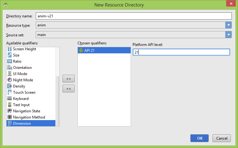
1. First we will create anim-v21 folder for the elevation animation. Go to res folder and right click on it – select New – Android Resource directory – and from the Resource type drop down select anim – select Version qualifier and inside the edit text from the right write 21.
Do the same for the other 3 directories.
2. Now that the anim-v21 directory is created you should add a new xml to it. So right click on anim-v21 and create a new xml file with the name of button_elevation.xml.
<?xml version="1.0" encoding="utf-8"?>
<selector xmlns:android="http://schemas.android.com/apk/res/android">
    <item android:state_pressed="true">
        <objectAnimator
            android:propertyName="translationZ"
            android:duration="@android:integer/config_shortAnimTime"
            android:valueFrom="@dimen/elevation_low"
            android:valueTo="@dimen/elevation_high"
            android:valueType="floatType"/>
    </item>
    <item>
        <objectAnimator
            android:propertyName="translationZ"
            android:duration="@android:integer/config_shortAnimTime"
            android:valueFrom="@dimen/elevation_high"
            android:valueTo="@dimen/elevation_low"
            android:valueType="floatType"/>
    </item>
</selector>
3. Now, go to res – drawable-v21 and create a new xml named oval_ripple.xml in order to add the ripple effect and the floating action button shape:
<?xml version="1.0" encoding="utf-8"?>
<ripple xmlns:android="http://schemas.android.com/apk/res/android"
    android:color="?android:colorControlHighlight">
    <item>
        <shape android:shape="oval">
            <solid android:color="?attr/colorAccent"/>
        </shape>
    </item>
</ripple>
4. Now go to res – layout-v21 and create a new xml named activity_main.xml. This is the same xml used in our activity but we have to create it again in order to add the elevation attribute and stateListAnimator which are available only starting api level 21.
<RelativeLayout xmlns:android="http://schemas.android.com/apk/res/android"
             xmlns:tools="http://schemas.android.com/tools"
             android:layout_width="match_parent"
             android:layout_height="match_parent"
             tools:context=".MainActivity"
             android:background="@android:color/white">

    <ListView
        android:id="@+id/list"
        android:layout_width="fill_parent"
        android:layout_height="fill_parent"
        android:cacheColorHint="#00000000"
        android:transcriptMode="alwaysScroll"/>

    <ImageButton
        android:id="@+id/fab_image_button"
        android:layout_width="@dimen/fab_button_diameter"
        android:layout_height="@dimen/fab_button_diameter"
        android:layout_alignParentEnd="true"
        android:layout_alignParentBottom="true"
        android:layout_marginBottom="@dimen/fab_button_margin_bottom"
        android:layout_marginRight="@dimen/fab_button_margin_right"
        android:background="@drawable/oval_ripple"
        android:src="@drawable/fab_ic_add"
        android:tint="@android:color/white"
        android:elevation="@dimen/elevation_low"
        android:stateListAnimator="@anim/button_elevation"/>

</RelativeLayout>
5. And the final step is to customize the theme for api level 21 too. So go to res – values-21 and create a new xml names styles.xml. Copy the following code:
<resources>

    <!-- Base application theme. -->
    <style name="AppTheme" parent="Theme.AppCompat.Light.DarkActionBar">
        <!-- Customize your theme here. -->
        <item name="colorPrimary">@color/primary</item>
        <item name="colorPrimaryDark">@color/primaryDark</item>
        <item name="android:navigationBarColor">@color/primary</item>
        <item name="colorAccent">@color/primary</item>
    </style>

</resources>
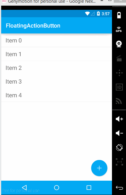
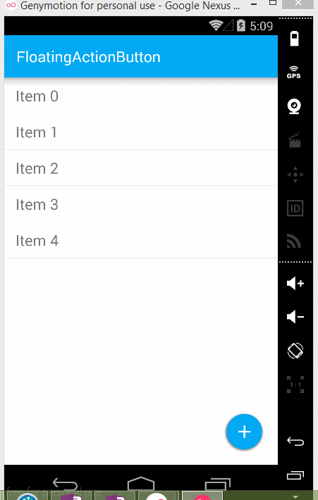
And that’s it. This is how the floating action should look like: